Excel seems to be the most hated tool I ever encountered. That’s a shame because if you look past this bad reputation it’s one of the best tools you can have on your belt for analytics.
In my experience, Excel is great for two purposes: high level reporting and data analysis.
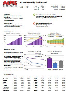
High level reporting is getting the pulse of your business. You can see more details in the article Startup reporting template for insight. It is not one of those hundred daily reports with hundred of KPI (Key Performance Indicators) and up to a hundred pages that only few read, and nobody act on. For these, any Business Intelligence reporting will work. A high-level report is the kind of report you want to read because it tells an important story (how the business is doing, why is that so, should you look for another job?). Even if most of Netflix decisions are based on analytics, it helps to add a bit of craft to the mix. For such report, maybe it’s just adding a label in a chart to remember that a specific product is declining because of an inventory issue or inform that the drop is located in a specific region. Numbers are fine, but it helps to have a bit of explanations.
For high-level reporting Excel is fine because it let you automate most of the work, while letting you add the final touch.
Data analysis is giving a businessperson the ability to understand what is happening underneath the high level reporting. It’s building a story where you are the hero. Sales numbers are down, nobody know why, find the culprit Sherlock.
Excel gives you the awesome pivot table, adding some formula here and there, nice cell conditional formatting. You might prefer to use code (SQL, Python or whatever) for clean processing, but for highlighting what is in your data, Excel is the best.
1 – Separate data, computation and presentation for sanity
Your Excel sheet reflect your state of mind. It can be clean, or it can be chaos. Don’t let it be the latter.
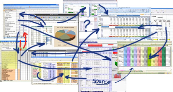
Inspired from the Model-View-Controller from webapps, I split my Excels sheets in 3 kinds of tabs.
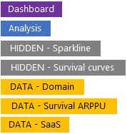
The first kind is the presentation sheets which regroup the Dashboard and the Analysis sheets. The Dashboard is obviously the neat part (the part you see in the startup reporting article). I also add an Analysis sheet where I put a big dynamic cross table where users can dig deeper if something in the Dashboard part need closer examination.
The second kind is the Data layer. In those sheets (one per data source), there is data and only raw data. No formulas. I tag them DATA and put them always in yellow.
The last kind of sheets is the computing sheet. This is where I put the business logic (and all those Excel formulas). Those are tagged HIDDEN and in gray because no user should go there (and they are hidden most of the time).
This simple separation of concern will provide you peace of mind. If there is an issue, you know you should first check the relevant DATA sheet, then, if the error is not there, the relevant HIDDEN sheet. You should have a simple data lineage.
In the next step, we will see how to update the Data layer automatically.
2 – Data connection is key to automation – Stop copy/paste
One reason people hate Excel is because most people end up spending hours copy/pasting. Truth is no Excel report should be more than one click away from being refreshed.
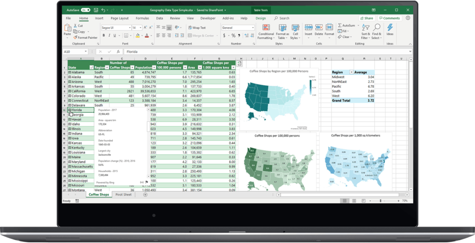
Let’s assume you have a Postgresql as a datamart where the IT dump some production data every night (can be a shared directory but a database is way more effective). Using the right ODBC driver (a common middleware that Excel understand), you can read the database directly from Excel. You can select a table, or even write a proper SQL query. This nice tool is in Get Data -> From Other Sources -> From ODBC (the From Database should be read From Microsoft Databases).
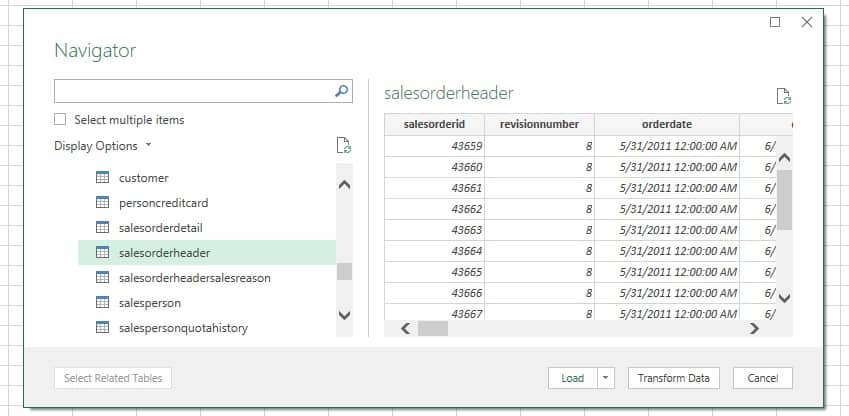
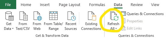
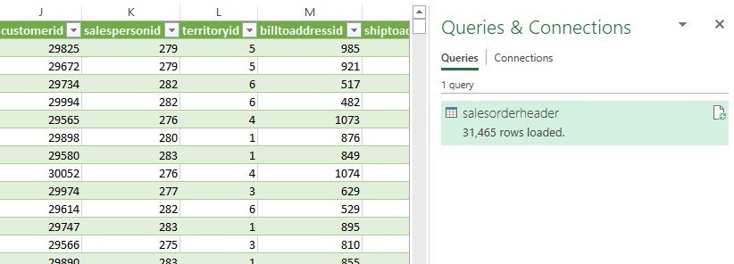
Just press Load and the data will be loaded from the database. The nice thing is that it will open a query panel where you can refresh the data at will (note: the Refresh All button from the Data panel works as well).
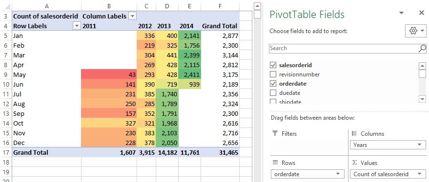
We are, therefore, some clicks away from a pivot table with conditional formatting where you can easily spot that there is a seasonality effect in February and a big lift starting in July 2013.
With such tool, you can create easily create a high level report like the one we did for Brewnation. Just remember to create one sheet for each data connections, one or more for computations and one for the presentation.
Speaking of computations, those are painful and error prone with Excel formulas. Good news, there is a better way with PowerBI.
3 – PowerBI for Excel is key to superpowers
There is one more level to the Excel superpowers. It’s cleverly hidden by Microsoft. I call it PowerBI for Excel, but PowerBI is now a separated product line with a different approach (but the core is the same). Back in the days, it was called Power Pivot and Power Query, but it’s long gone. Those day it’s just a feature Excel few know about.
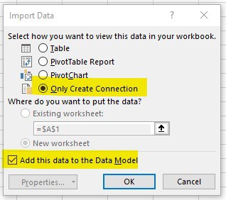
In the previous section, we established a link between Excel and a data source. Instead of loading those data in a sheet, let’s load it in the PowerBI engine. Instead of the “Load” button, use the “Load to” to open the “Import Data” dialog box. Here we will just create the connection and add the data to the Data Model.
The Data Model is the storage part of PowerBI. No longer are you limited with the 1 million rows of Excel. This columnar compressed storage is also quite good at using only a small space footprint.
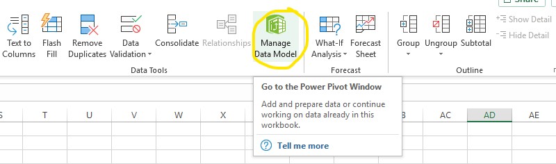
To show what’s in this data model, use the “Manage Data Model” button in the Data ribbon.
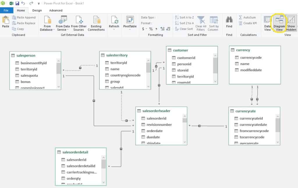
This whole model can be enhanced add new computed columns and aggregate measures. In fact, most of your computation layer can fit in the PowerBI engine.
As you can see, Excel is really powerful once you know how to use it. It is THE mainstream analytics tool. This article just scratches what you can achieve with PowerBI, so subscribe to our mailing list to be informed.
Let's stay in touch with the newsletter

Leave a Reply
You must be logged in to post a comment.