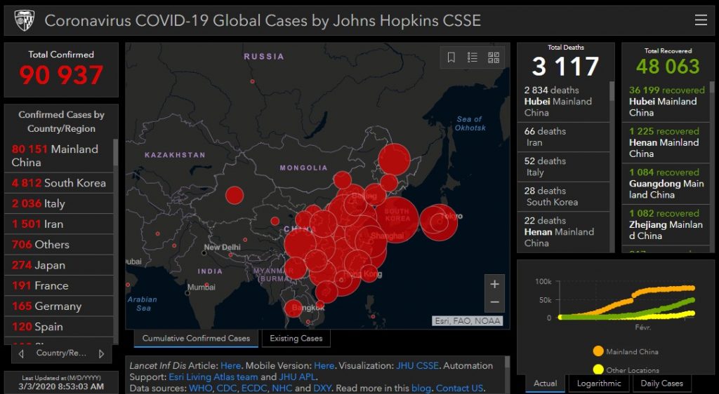
As everyone, I want to monitor the propagation of the Covid-19. There is a nice dashboard from the Johns Hopkins University but it didn’t fit my need. It displays all the numbers but doesn’t provide a clear information of the development of the situation.
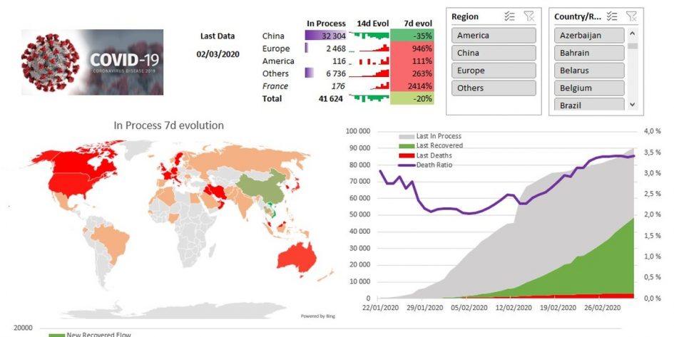
Luckily for me, I’m love swimming in data so what better usage of a rainy Sunday afternoon? After some hours, I’ve got my very own dashboard (see below). As it provides a very good real life example of using Excel, Power Query and Power Pivot tools, this article will guide you through the process (and some bottlenecks).
In this post we will:
– Link to a github dataset
– Clean up the data with Power Query
– Define smart metrics using with Power Pivot
– Create a visualization using Excel
Along the way we will learn the following things :
– How to import a CSV with a variable number of columns
– How to unpivot with a variable number of columns
– Using the culture parameter in Power Query
– Define a custom function in Power Query as standalone or inside another query
– Import data from Wikipedia in Power Query
– Using date intelligence in Power Pivot
– Accessing a single data point from the Data Model with Excel formulas
– Making a map in Excel
You can download the Excel file here.
Connection to the data

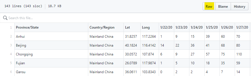
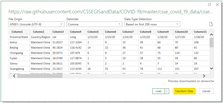
The first thing is always to get data. Luckily for us, the Johns Hopkins University provides a wonderful Github with updated data. We will use the csse_covid_19_data/csse_covid_19_time_series. There are three files, one for the number of confirmed cases, the number of deaths and the number of recovery. For each file, the first four column provide the location and we have a column per date. Each date, this file gets a new column and sometimes new rows.
Connection to a github CSV file
We will use Excel for the data transformation and modeling, but Power BI Desktop would be quite similar. Under the Data panel, we click From Web and put the raw file url.
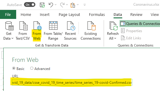
It is almost that simple and we immediately get a preview. There is a bit of cleanup to do so we will transform the data first.
Cleaning the data with Power Query
Clicking on Transform Data will open a Power Query window. The easy thing to do is to set the first row as column names (highlighted button in the capture below). Nevertheless, as you can see in the formula section, Power Query try to be smart and to convert some columns as numbers. He is right but that will not work. Remember, every day there is a new column.
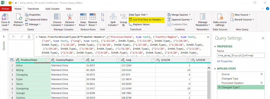
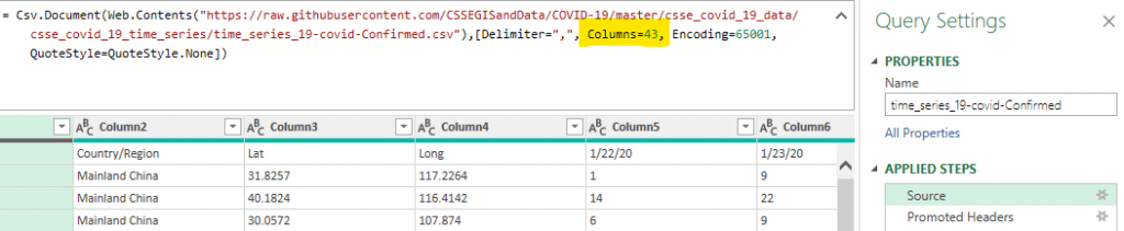
The first thing to do is to delete the “Change Type” steps (we will address that later). Then, in the “Source” step, you need to manual edit the formula and remove the “Columns=43,” part (the number will be bigger every day).
Now comes the time to put the dates as rows instead of columns. As a rule of thumb, you should never have dates as column. It is always easier to manipulate data where the number of columns is small and fixed.
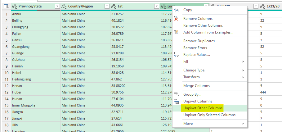
Power Query makes it very for us, you just have to select the columns that should remain columns and select “Unpivot Other Columns”. That will remove all the other columns and provide only two new columns,
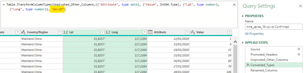
The rest is just renaming some columns and changing types. For change the date type, it’s easy if you are in an english locale. For some people (like the French), you need to add an extra parameter to the Table.TransformColumnTypes which is “en-US”. Why Power BI is based on locales (what they call cultures) and not on patterns is a mystery to me. The Power Query documentation is of no help neither.
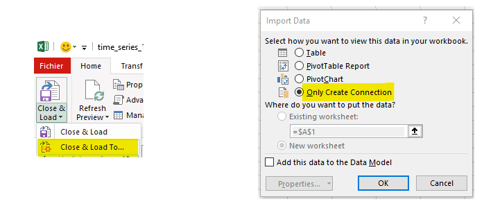
We can finally same this Power Query connection, but we will use the “Close & Load To …” option and just create a connection. That will avoid creating a table in Excel that would be of no use. We neither add it to the Data Model.
We do the same process for Deaths and Recovered data sources. In order to save some time, you can start from a Blank Query and use the full code (in M language) from the above connection (given below). You need to change the URL and some columns names.
let
    Source = Csv.Document(Web.Contents("https://raw.githubusercontent.com/CSSEGISandData/COVID-19/master/csse_covid_19_data/csse_covid_19_time_series/time_series_19-covid-Confirmed.csv"),[Delimiter=",", Encoding=65001, QuoteStyle=QuoteStyle.None]),
    Promoted_Headers = Table.PromoteHeaders(Source, [PromoteAllScalars=true]),
    Unpivoted_Other_Columns = Table.UnpivotOtherColumns(Promoted_Headers, {"Long", "Lat", "Country/Region", "Province/State"}, "Attribute", "Value"),
    Converted_Types = Table.TransformColumnTypes(Unpivoted_Other_Columns,{{"Attribute", type date}, {"Value", Int64.Type}, {"Lat", type number}, {"Long", type number}}, "en-US"),
    Renamed_Columns = Table.RenameColumns(Converted_Types,{{"Attribute", "Date"}, {"Value", "Confirmed"}})
in
    Renamed_Columns
That was part one of the data processing, in the second part we will improve the data so the modeling part will be easier.
Expanding the data with Power Query
In this section we will:
– merge the three data sources (confirmed, deaths and recovered) to simplify the model
– find the daily variation from the daily cumulative sum
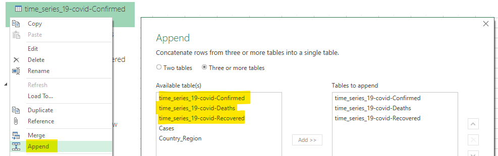
The first part is quite easy, click left on one of the three queries, click Append, select Three or more tables and add them to the left. It opens a Power Query windows where your queries are combined.
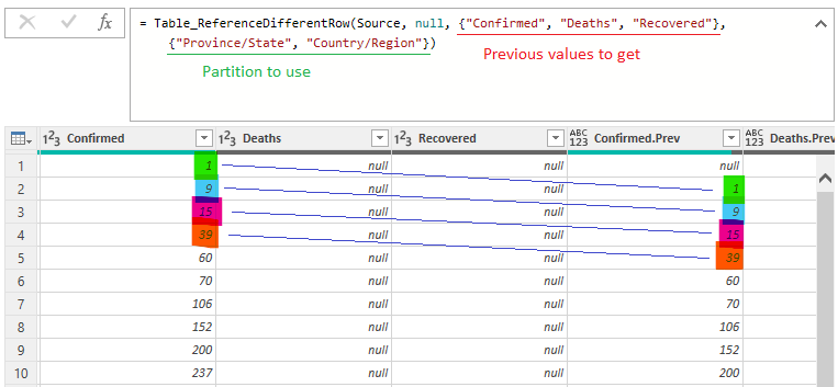
From there, all is well and you can make a dashboard like the one from Johns Hopkins University . But I also want to have the variation of each metrics from the last observation (last day). To compute the variation, I need to put on the same row the current value and one from the row above. I need to do this separately from each Province and Country partition (the last row from France can’t be used with the first row of Germany).
That would be easy in SQL, it would be like lag(confirmed) over (partition by state, country order by date asc). It’s not that hard in Power Pivot, but it’s more expensive (as it computes at interaction time). In Power Query (which compute only at refresh time), it’s not that easy.
For that we will import an awesome function from thebiaccountant.com. We create a blank query named Table_ReferenceDifferentRow with the following code:
// All rights to Imke Feldmann (www.TheBIccountant.com )
let func =
(Table as table, optional Step as number, optional SelectedColumns, optional GroupByColumns, optional Suffix as text, optional Buffer as any) =>
let
// Steps to prepare the (optional) parameters for the nested function "fnFetchNextRow"
Source = if Buffer = null then Table else Table.Buffer(Table),
Step0 = if Step = null then -1 else Step,
Step_ = if Step = null then 1 else Number.Abs(Step),
Suffix = if Suffix = null then ".Prev" else Suffix,
GroupByColumns = if GroupByColumns = null then null else GroupByColumns,
ShiftFunction = if Step0 < 0 then Table.RemoveLastN else Table.RemoveFirstN,
ColNames = List.Buffer(Table.ColumnNames(Source)),
NewColNames = if SelectedColumns = null then ColNames else SelectedColumns,
CountNewCols = List.Count(NewColNames),
// Core function that retrieves values from previous or next rows (depending on sign of parameter "Step")
fnFetchNextRow = (Table_ as table, optional Step as number, optional SelectedColumns, optional Suffix as text, optional Buffer as any) =>
let
MergeTable = if SelectedColumns = null then Table_ else Table.SelectColumns(Table_, SelectedColumns),
Shift = if Step0 > 0 then ShiftFunction(MergeTable, Step_) & #table(NewColNames, List.Repeat({List.Repeat({null}, CountNewCols)}, Step_))
else #table(NewColNames, List.Repeat({List.Repeat({null}, CountNewCols)}, Step_)) & ShiftFunction(MergeTable, Step_),
Reassemble = Table.ToColumns(Table_) & Table.ToColumns(Shift),
Custom1 = Table.FromColumns( Reassemble, Table.ColumnNames(Source) & List.Transform(NewColNames, each _&Suffix ) )
in
Custom1,
// optional grouping on certain columns
#"Grouped Rows" = Table.Group(Source, GroupByColumns, {{"All", each _}}, GroupKind.Local),
#"Added Custom" = Table.AddColumn(#"Grouped Rows", "Custom", each fnFetchNextRow([All], Step0, SelectedColumns, Suffix, Buffer)),
#"Removed Columns" = Table.Combine(Table.RemoveColumns(#"Added Custom", GroupByColumns & {"All"})[Custom]),
// case no grouping
NoGroup = fnFetchNextRow(Source, Step0, SelectedColumns, Suffix, Buffer),
// select case grouping
Result = if GroupByColumns = null then NoGroup else #"Removed Columns"
in
Result ,
documentation = [
Documentation.Name = " Table.ReferenceDifferentRow ",
Documentation.Description = " Adds columns to a <code>Table</code> with values from previous or next rows (according to the <code>Step</code>-index in the 2nd parameter) ",
Documentation.LongDescription = " Adds columns to a <code>Table</code> with values from previous or next rows (according to the <code>Step</code>-index in the 2nd parameter) ",
Documentation.Category = " Table ",
Documentation.Source = " ",
Documentation.Version = " 1.0 ",
Documentation.Author = " Imke Feldmann (www.TheBIccountant.com ) ",
Documentation.Examples = {[Description = " ",
Code = " Table.ReferenceDifferentRow( #table( {""Product"", ""Value""}, List.Zip( { {""A"" ,""A"" ,""B"" ,""B"" ,""B""}, {""1"" ,""2"" ,""3"" ,""4"" ,""5""} } ) ) ) ",
Result = " #table( {""Product"", ""Value"", ""Product.Prev"", ""Value.Prev""}, List.Zip( { {""A"" ,""A"" ,""B"" ,""B"" ,""B""}, {""1"" ,""2"" ,""3"" ,""4"" ,""5""}, {null ,""A"" ,""A"" ,""B"" ,""B""}, {null ,""1"" ,""2"" ,""3"" ,""4""} } ) ) "]}]
in
Value.ReplaceType(func, Value.ReplaceMetadata(Value.Type(func), documentation))
Now we can use it in our query to get, for each row, the previous value of confirmed, deaths and recovered.
Our query Cases (final fact table), will have the Power Query code below.
let
    // You can define functions inside the query
    fn_Diff = (old, new) =>
        let res = if new is null then null
            else if old is null then new
            else new-old
        in res,
    Source = Table.Combine({#"time_series_19-covid-Confirmed", #"time_series_19-covid-Deaths", #"time_series_19-covid-Recovered"}),
    Added_Lag_Values = Table_ReferenceDifferentRow(Source, null, {"Confirmed", "Deaths", "Recovered"}, {"Province/State", "Country/Region"}),
    Added_New_Confirmed = Table.AddColumn(Added_Lag_Values, "New Confirmed Value", each fn_Diff([Confirmed.Prev], [Confirmed])),
    Added_New_Deaths = Table.AddColumn(Added_New_Confirmed, "New Deaths Value", each fn_Diff([Deaths.Prev], [Deaths])),
    Added_New_Recovered = Table.AddColumn(Added_New_Deaths, "New Recovered Value", each fn_Diff([Recovered.Prev], [Recovered])),
    Removed_Columns = Table.RemoveColumns(Added_New_Recovered,{"Confirmed.Prev", "Deaths.Prev", "Recovered.Prev"}),
    Changed_Types = Table.TransformColumnTypes(Removed_Columns,{{"New Confirmed Value", Int64.Type}, {"New Deaths Value", Int64.Type}, {"New Recovered Value", Int64.Type}})
in
    Changed_Types
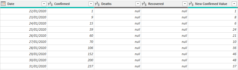
We now have a fact table with, for each day and each location, the number of new confirmed cases, deaths and recovered along with the cumulative value since the beginning. We will load this query in the Data Model.
Enrich the data with Wikipedia
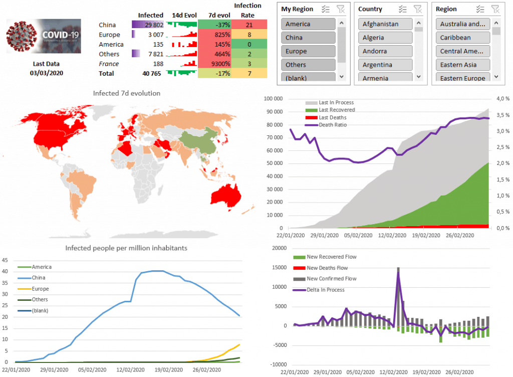
After a first draft, I found that the number of cases is interesting, but having the ability to relate it to the population would be nice. Indeed, is 30k cases is China similar, worse or better than 3k cases in Europe? China is a huge country after all. I needed to compare data to population.
One awesome feature of Power Query is the ease to import data from the web. We can use Data panel then From Web and set the url. As before, we select Transform and shape it a little bit.
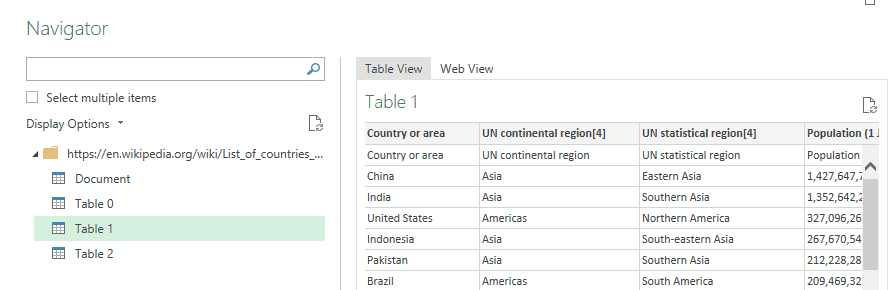
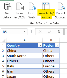
As I want a custom clustering of countries, I set a reference table in Excel setting for each country my Region (the column will be renamed My Region later to avoid confusion with the UN Region). We can import it in Power Query with From Table/Range and merge it with the Wikipedia query with the Country column.
That will make a country dimension.
Now, blending this country dimension with the fact table isn’t that easy because some countries have different spelling (US vs United States, Mainland China vs China). And, obviously, the Diamond Princess boat isn’t a country. That’s some steps to add to our fact table query.
Now it’s modeling time
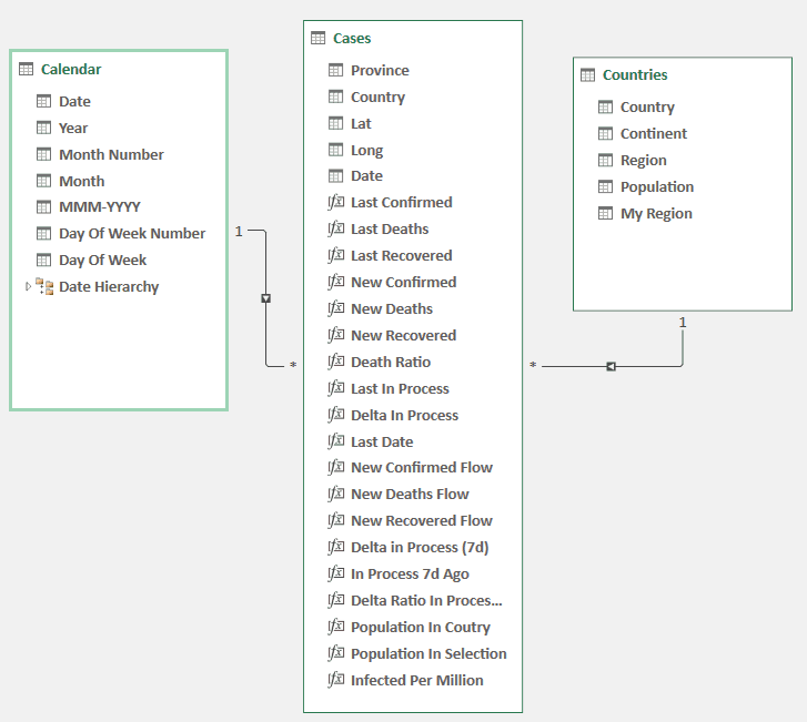
Now that the data source is clean, we will model it (on Excel under the Data panel then Manage Data Model) and add insightful metrics to create a nice dashboard. The final model will be the one below. We already have the Cases table (but haven’t see the metrics) and the Countries dimension. below you can see the model using the Diagram View. Notice that relation where made between column with the same name (you can drag and drop column name if it’s not done automatically).
The calendar table was created using Power Pivot (under Design then Data Table then New) which was then marked as the date table. I never used the Power Pivot generated Data Table before, but it seems will be enough for now.
Now let’s play a bit with DAX, the language of Power Pivot.
Semi-additives measures
The first issue we face is the inventory metrics like the number of confirmed cases. Indeed, we have for each day the number of confirmed cases for every location. We can add each location to have the total number of confirmed cases for a day. But we can’t add it across different days.
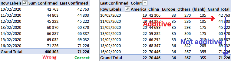
For most of the reporting, this is not an issue as you know that you shouldn’t add cases across days. The strength of Power BI is its flexibility, it open a world when you just drag and drop metrics and dimensions and it works. You can’t think about fully your business case (well … a world health case here) and about limitation in your metrics.
The DAX code is given below. We first create Sum Confirmed which is just a sum of confirmed cases. As this metrics shouldn’t be used in the dashboard, we can click left on it and select Hide from Client Tools. The second measure is more advance. We use the CALCULATE function (which takes an expression and some filters) and add a filter which is the last date where Sum Confirmed is not null in the current context. That mean that without any context (just the measure in a pivot table), it will display the number of confirmed cases as of yesterday (the last date in the data source). But if you use the metric in a weekly bar chart, it will display the number of cases on Sunday of each week (if your weeks end with Sunday, as it should be). The is an exception for the last week of data, which will use the last day of data.
Sum Confirmed:=SUM('Cases'[Confirmed])
Last Confirmed:=CALCULATE('Cases'[Sum Confirmed]; LASTNONBLANK('Calendar'[Date]; 'Cases'[Sum Confirmed]))
Using the same process for Last Deaths and Last Recovered which can derive the number of people infected (which I call in process to be less dramatic). And the Death ratio (which should have been called fatality ratio)
Last In Process:=[Last Confirmed]-[Last Deaths]-[Last Recovered] Death Ratio:=IFERROR([Last Deaths]/[Last Confirmed];"")
More time intelligence
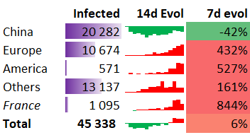
Having a static picture is nice, but what matter is the evolution. This will be the 7d evolution KPI (see below). It represents the variation of infected people since the previous week (7 days). Above 0 the situation is worsening, below zero is it getting better.
For computing the evolution, we need to bring a value from 7 days ago to the current row.
Sum In Process:=[Sum Confirmed]-[Sum Deaths]-[Sum Recovered]In Process 7d Ago:=CALCULATE([Sum In Process];DATEADD(LASTDATE('Cases'[Date]);-7;DAY))Delta Ratio In Process (7d):=[Delta in Process (7d)]/[In Process 7d Ago]
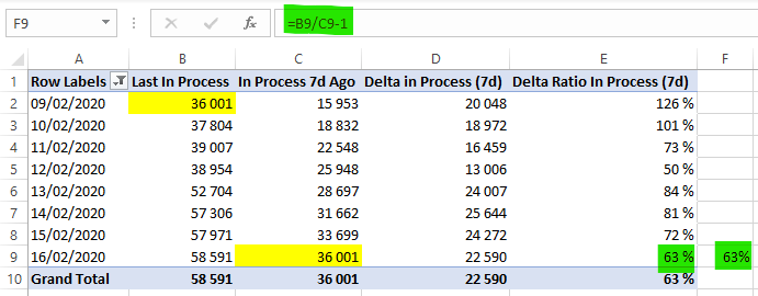
Alternatively, we can use DATESINPERIOD to select all dates (Delta In Process being the variation from the previous day) from the last date of the context to 7 days ago. Notice that I used LASTDATE instead of LASTNONBLANK. While it doesn’t change anything here, LASTNONBLANK is safer.
Delta in Process (7d):=CALCULATE([Delta In Process]; DATESINPERIOD('Cases'[Date];LASTDATE('Cases'[Date]); -7; DAY))
Those little sparklines (CUBEVALUE inside)
Do you love sparklines? I love them. So much information density. As you can see below in the column 14d Evol (evolution over 14 days), it’s a little graph that is hosted in a cell.

We will use another awesome feature of Excel, the CUBEVALUE formula that allows you to fill a cell with a cell value from the Power Pivot Data Model. For instance, to get the 7d evol value for China, we use the following formula:
=CUBEVALUE("ThisWorkbookDataModel";"[Measures].[Delta Ratio In Process (7d)]";"[Countries].[My Region].[China]")
Now that’s a complex function but suffice to say that the first parameter is always ThisWorkbookDataModel, the first one is from the measure set (you have auto-completion after the first dot) and then you add filters. Notice that parameters are text, so you can construct them using formulas as well.
For a sparkline, we will have a series of such cells. Let’s create a new sheet HIDDEN – Sparklines (go to this article to learn how I structure my Excel workbooks) to store the underlying data from those sparklines.
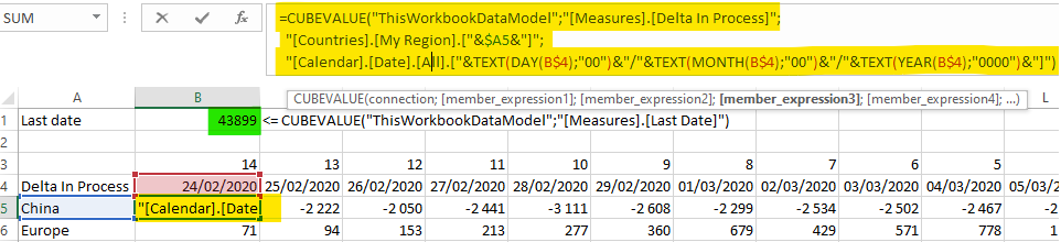
In cell B1, we put the last date (as each sparkline represents the last 14 days). The formula is =CUBEVALUE("ThisWorkbookDataModel";"[Measures].[Last Date]") where Last Date is a Power Pivot measure: Last Date:=LASTNONBLANK('Calendar'[Date]; 'Cases'[Sum Confirmed]). Notice it returns a number as Excel represents dates as numbers (you can format the cell as date if you prefer).
As you can see in row 3, I set some offset values, from 14 to 0 (14 days ago to last date). We obtain row 4 by subtracting row 3 cells to $B$1.
We can now set the cell formulas using the cubevalue function (see below for the B5 formula). In case you wonder, you can return to line in the formula box but hitting Alt + Enter. Notice as well that my Calendar dimension is in French, so days are given before months (24/02 and not 02/24).
=CUBEVALUE("ThisWorkbookDataModel";"[Measures].[Delta In Process]";
   "[Countries].[My Region].["&$A5&"]";
   "[Calendar].[Date].[All].["&TEXT(DAY(B$4);"00")&"/"&TEXT(MONTH(B$4);"00")&"/"&TEXT(YEAR(B$4);"0000")&"]")
Then we can extend the formula above all the cells (except France which is not a region but a country, and the total which doesn’t take a region).
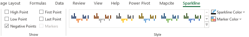
Finally, we can insert the Sparkline but using the Insert panel, and click Column inside the Sparklines section. We can format it a bit, selecting the Negative Points option and using Marker Color to set positive values as red and negative values as green.
That’s good, but we can’t make a row for every country (it would be too long). The straightforward way is to use a map.
Give me a map
Most people don’t know that you can plot a map in Excel. I should add that it’s really nice. But there is a trick to make it work.
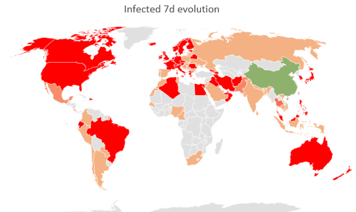
The first step is to create a new sheet HIDDEN – Map with a pivot table (country and Delta Ratio In Process (7d)). Then, you copy part of it to the blank area on the left. Believe it or not, it can’t work on a pivot table (yet). Then you select this area and go to Insert -> Map -> Filled Map. You get the result below. Now, after selecting the map you can go to Chart Design then Select Data to use the pivot table instead. You can extend it to the bottom to allow the pivot table to extend in the future (you can optionally remove the Grand Total line).
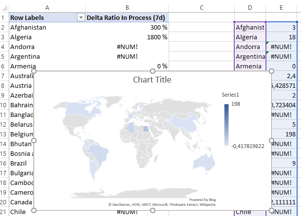
With a bit of makeup, you get the final map. Notably I add a white rectangular shape on the top right because it complains that some countries are not correct (countries that I didn’t care fixing).
Let’s go back to the Wikipedia data
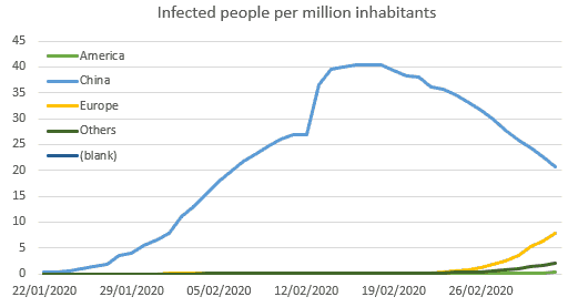
After playing a bit with the dashboard, I asked myself how to compare the situation in Europe versus China. I defined that what matter is the probability the someone is carrying the disease. We can express that using the number of infected people per million inhabitants.
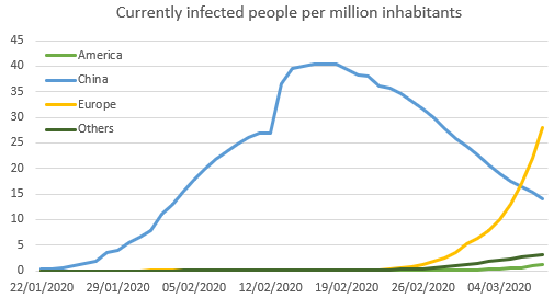
We need a new metric that is the following:
Infected Per Million:=[Last In Process]/[Population In Selection]*1000000
We already have Last In Process, but how to obtain Population In Selection?
We will use the SUMX function that sum “row by row” an expression over a table. In our case, the table will be the distinct values of countries. Remember, even for one day, China has many rows (one for each province). The distinct part will deduplicate that. Then, for each country, we will look inside the country table and search the population using the LOOKUPVALUE function.
Population In Selection := SUMX(
     DISTINCT('Cases'[Country]);
     LOOKUPVALUE('Countries'[Population];
         Countries[Country];
         'Cases'[Country])
     )
Enough of DAX madness for the day. You can congratulate yourself for surviving so far.
I’m always amazed about the insane amount of technologies that Excel hide under the hood. M, DAX, maps, you are only limited by your imagination!
Let's stay in touch with the newsletter